Responsive mobile navigation menu bar in Carrd without code
Yes, it's finally possible, using just native Carrd elements
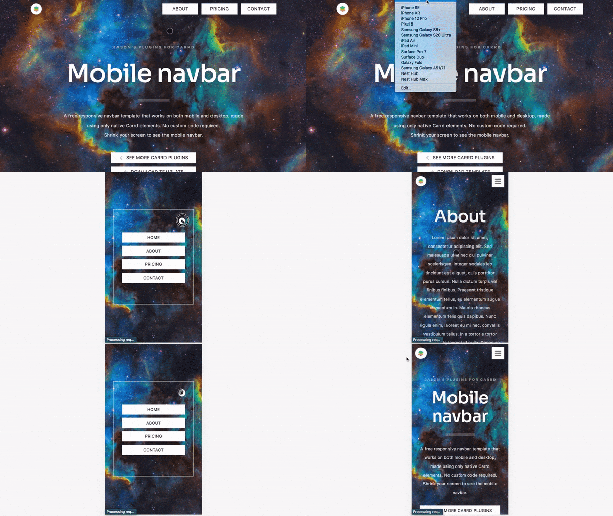
I was fiddling with the new Visibility settings on Carrd recently and realised we can now make a navigation menu that works responsively on both desktop and mobile, without any custom code!
A row-format nav menu on desktop that changes to a hamburger nav menu on mobile.
Sharing this FREE template with the community:
Tutorial here:
📖 starrt.co/blog/mobile-responsive-nav-menu
Premium template here with more features:
mobile menu appears on same page, not redirected to a separate Section
sticky nav menu header


